

SKEYNDOR POWER C+
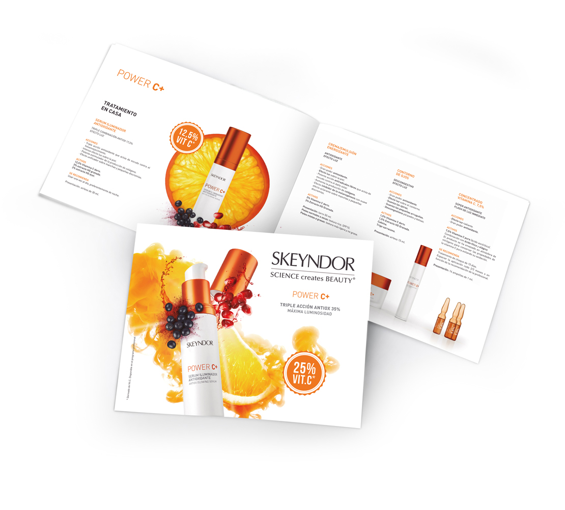
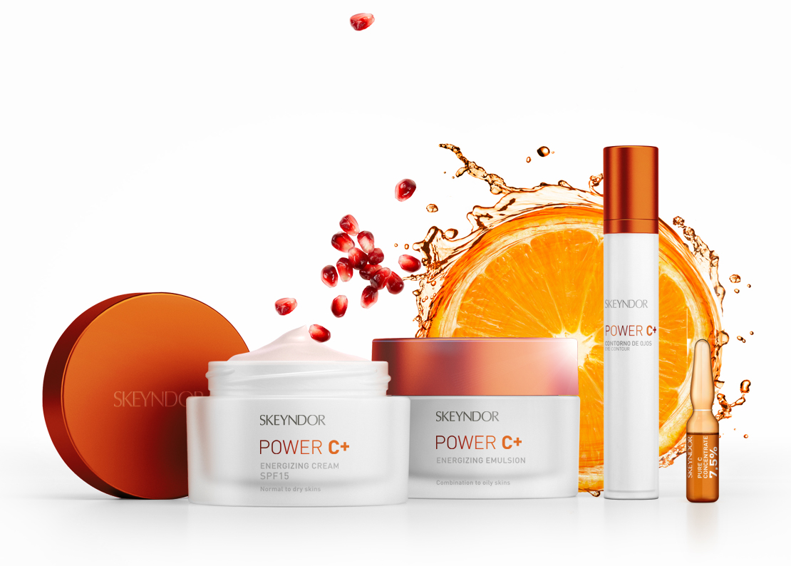
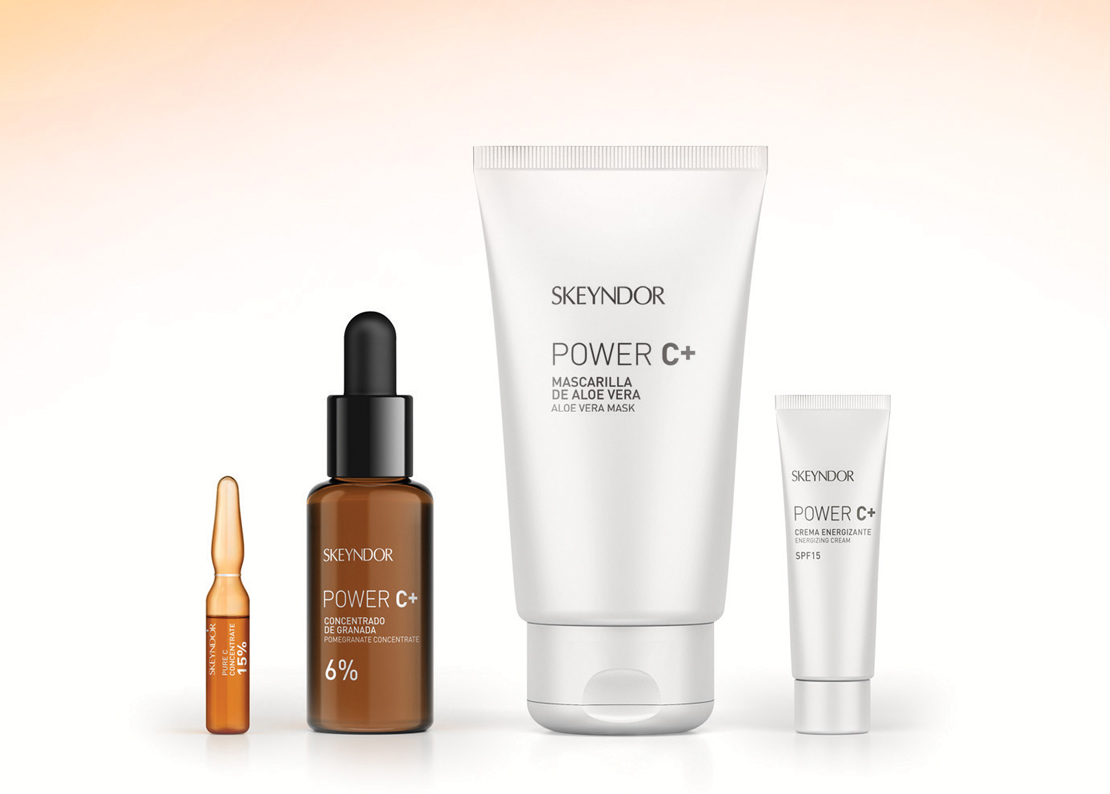
What: relaunch of the sub-brand, packaging, visual, campaign, communication and PLV.
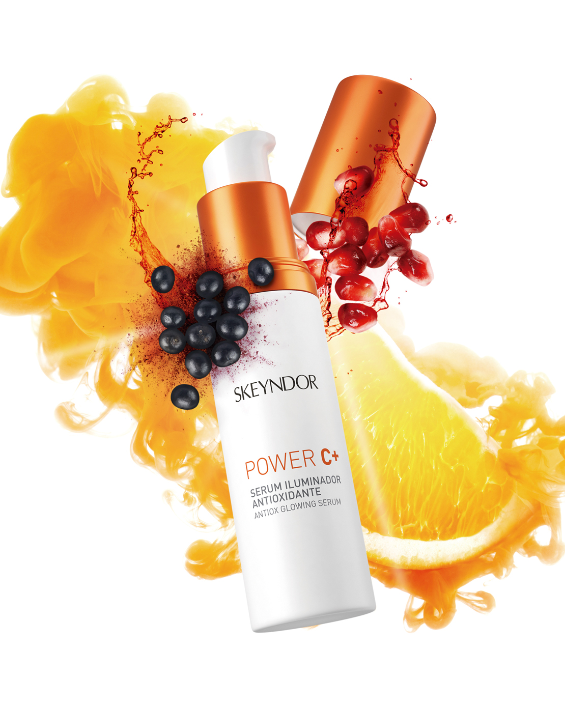
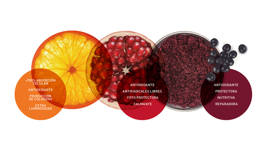
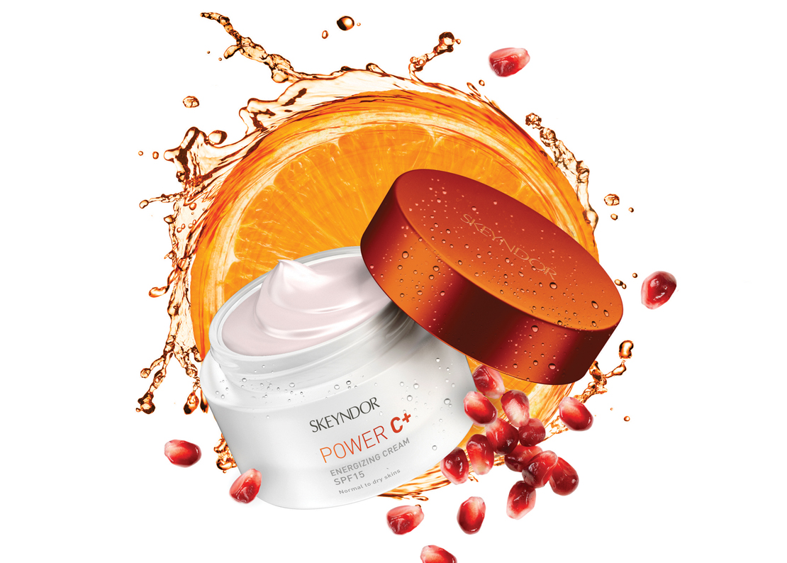
How: With this design we wanted to transmit strong antioxidant power and super brightness (luminous glow) of Skeyndor Power line C +. We think about this a code of reddish orange, which represents the mix of the two main components of the product: pomegranate extracts and orange. We create a powerful visual key to project vitality, to represent the benefits of the product.